The LOGO I designed adopts a simple and modern geometric structure, with the letter "N" as the core for visual expression. It uses the artistic form of the game Monument Valley, representing a kind of infiniteness and playfulness.
The LOGO created a switch animation design, but it has now been lost due to the damage of the AE file...

For the wireframe, we have 2 platforms.
For the app, we'll focus on providing advanced features for experienced players, like detailed stats, customized features, and community forums where they can dive deep into strategy.
For the WeChat mini program, we’ll prioritize quick access for NFT beginners, highlighting collection, and fast trading interactions, keeping everything easy to navigate.
Both versions have a clean header, a dynamic home screen with featured content, and easy access to profiles and settings.
wireframe- Ports and founctions

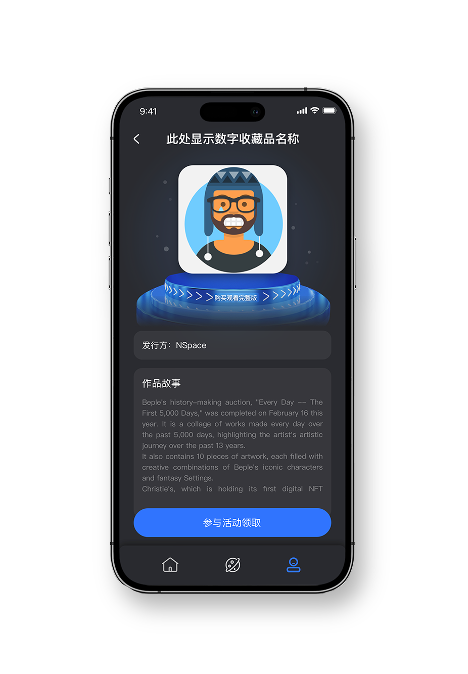
Collectibles gallery
The Digital Collectibles page lets users curate and showcase their NFTs. In the Digital Collectibles , users can freely browse all the NFTs they own and even gift them to friends, it is turning digital ownership into a more social and meaningful experience.
Showcase your NFTs
This feature allows users to display their customised NFTs to social media. For many young people in China, NFTs are a way of showing off personal style, almost like digital fashion. So having a card to showcase them is key to encouraging self-expression and identity building.
NFT community
The community feature creates space for users to design their NFTs and share to comuinity, or find other people's designed NFTs and get it through community activities. It gives young users that sense of belonging they’re after through trendy collectibles and shared community vibes.
We chose this colour scheme to create a modern, tech-forward, and futuristic vibe, especially for a young Chinese audience in the NFT space. The deep grey and black give a sense of mystery and sophistication, highlighting the innovative and cutting-edge nature of the product. The bright blue adds energy and a digital feel, appealing to those interested in new technology. The light grey helps balance the overall design, keeping it sleek and elegant, while the white adds freshness and clarity, making the other colours stand out. Together, the colours reflect the digital art aspect of NFTs while resonating with the style and innovation that young people are drawn to.
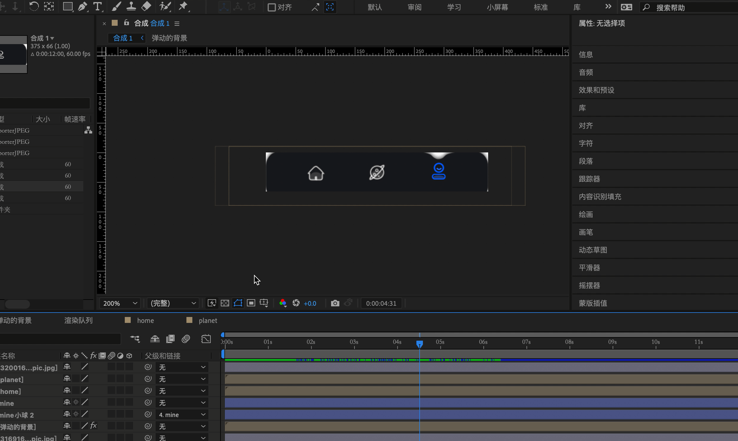
Generate demo through sketch to principle to communicate with product manager. After the communication is completed, communicate with programmer in AE output animation.

For the character design, I drew inspiration from some of the most popular street style and pop culture trends in China at the time. Elements like blonde hair, dreadlocks, ear piercings, and visual references to iconic films like Avatar were incorporated to resonate with young users. The goal was to create a look and feel that felt bold, expressive, and instantly relatable—something that reflected their tastes and made the NFTs feel personal and culturally relevant.

In December 2022, China's NFT development was still at an early stage — the market remained in a regulatory gray area, with relatively low financial attributes but a strong focus on collectible and trendy cultural elements. This visual system followed a "decentralized, light digital culture" strategy.It intentionally reduced financial visual cues commonly associated with NFTs,
aligned with the aesthetics and usage scenarios favored by young users (such as social media, avatars, and the metaverse),
and retained a solid foundation for IP scalability and customization.
"Playful”
llustration Style