
APP
UI
UX
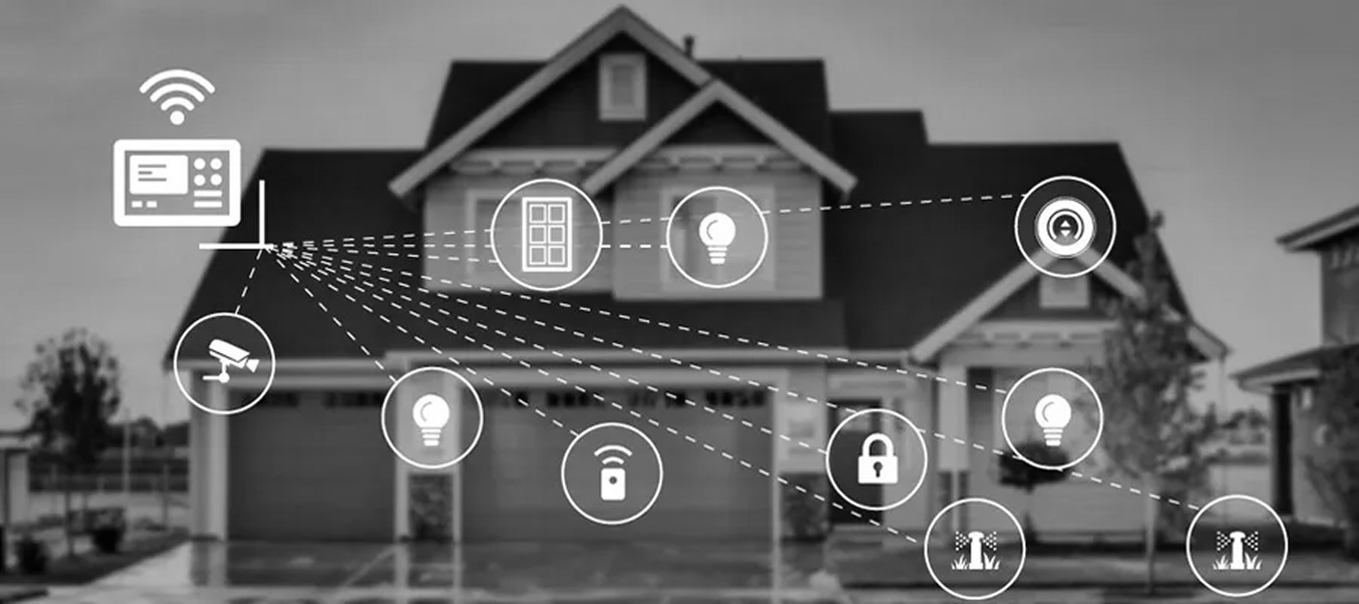
IoT


Manage lighting, temperature, music, and security systems at home or remotely. Customize scenarios for specific times, e.g morning wake-up or night mode.
View the status of home security devices like cameras and door/window sensors in real-time. Receive alerts for unusual activity.
Automatically adjust lighting and sound effects when syncing music with a sound system or watching movies.
Set up "Away Mode" or "Home Mode" to automatically turn specific devices off or on with one tap.


Through research and user interviews, three widely used international smart home apps were identified for comparative analysis: Apple HomeKit, Amazon Alexa, and Xiaomi Mi Home.
Looked at these 3 APPS from Old/New compression, APP store review, first hand experience, user interview.
Apple - Home Kit


✅
A flat and minimalist interface, reducing unnecessary secondary transitions.
Customizable logo light options allow users to reduce the issue of products looking too similar.
Listen to user needs and arrange automation in a separate page
❌
The 2D floor plan enhances user experience, but user feedback indicates that some still struggle to locate items because reality is 3D while the display is 2D.
The automation process remains quite complex, requiring users to set numerous conditions to achieve automation.Some settings are overly complicated.

Amazon - alexa

In December 2020 and 2023, new adjustments were made. Now, the "Home" tab is more organized, no longer randomly displaying "Most Relevant" and "Recently Used" items as before. It is also customizable, allowing you to choose what you want to see and use, rather than relying on what Alexa thinks you want to see.

✅
A significant improvement is the device screen. The "Home" tab now focuses more on smart home control, while "Devices" has become more like a settings page, "where you can do more complex tasks."
Product information is integrated into the first page, the Home, while in Alexa, it is displayed on a separate page.
Users can access the "Automation" feature from the "More" menu.
❌
In Amazon, the same feature sometimes appears simultaneously on the first screens of two pages, which affects space utilization efficiency.
The functions are repetitive and troublesome to use.

Xiao Mi - Mi Home

✅
Device management is convenient, Mijia App allows users to create groups of the same type of devices for centralized control, and can be managed by room to improve operation efficiency.
The automation page provides automation recommendations, matches devices in real-time, and suggests automation settings with different modes. I think this is a great feature.
❌
1. When using a large number of products, serious issues arise, such as severe product model homogenization and lack of customization options. As a result, users often don't know which product they are operating, and misoperation of lights is a common problem.
2. The remaining three pages of the product are entirely marketing information, with low utilization. The product structure is overly complex, leading to a poor user experience.
3. According to product feedback, users have mentioned that AI responses can affect their mood. For example, at midnight, when a user asks the AI to play a sleep-inducing song, the AI loudly responds, "Playing now." Therefore, more consideration needs to be given to the AI's non-intrusiveness.


Home Page Compare


Automation Page Compare


Bottom Bar Compare


Use an AI model generator, is not drawn by hand, and has references


Bottom Bar Compare


This color palette uses yellow as the primary color and dark gray as the base, complemented by frosted glass and noise textures. The design aims to create a cozy and relaxed atmosphere, evoking softness and warmth, perfectly aligned with the aesthetic and emotional tone of smart home users. The choice of materials and colors reflects a balance between modern sophistication and a welcoming, homey feel, enhancing the overall user experience.


Home


Automation


AI Explore
